When people hear that a children’s book was illustrated using Canva, they may imagine choosing a ready-made template, dropping in some text, and calling it finished.
That was definitely not my experience.
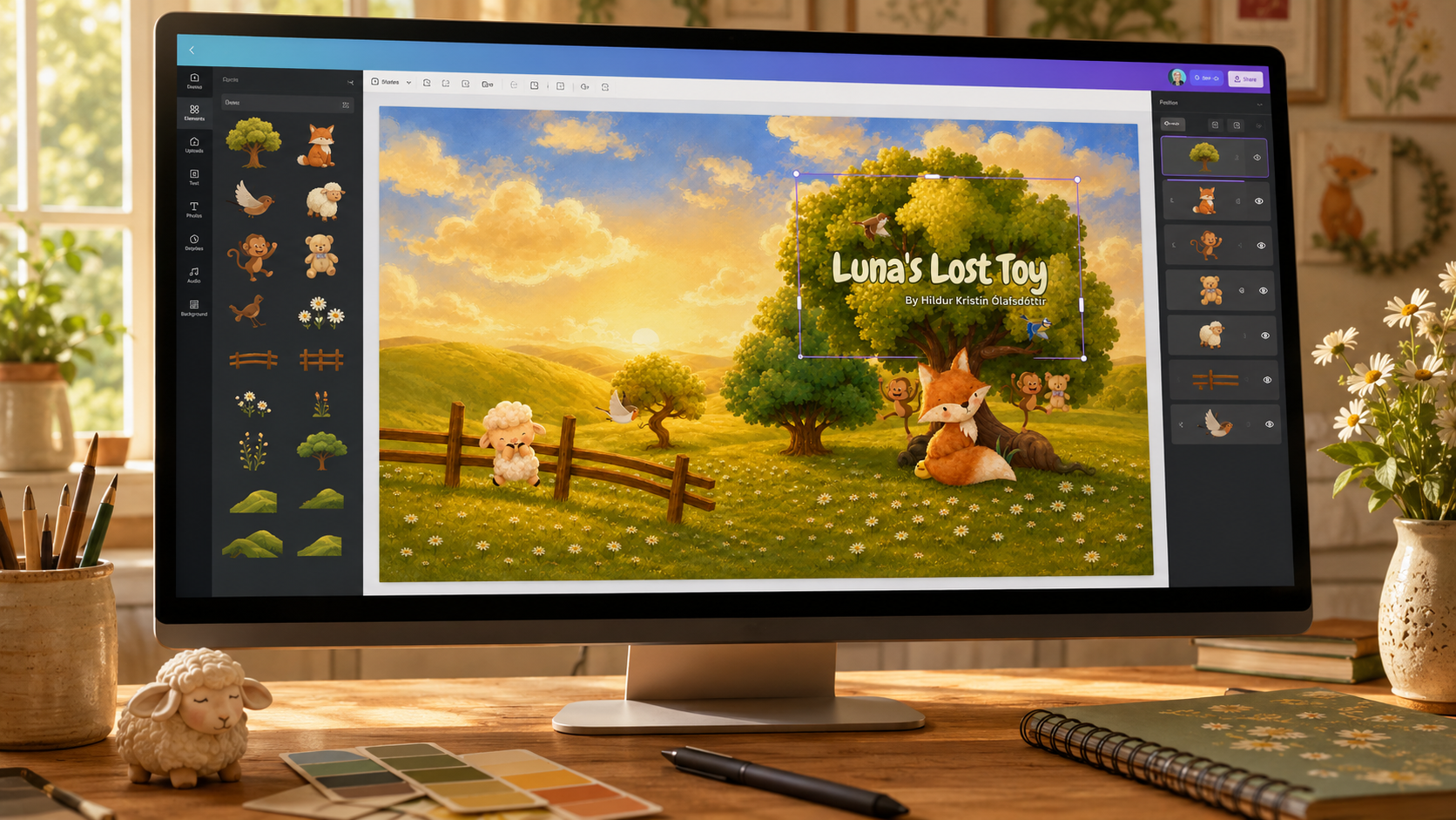
I used Canva Pro while creating my children’s book illustrations, but the finished pages did not come from a single template or a one-click solution. I spent a great deal of time searching for individual characters, backgrounds, plants, furniture, animals, and tiny decorative details. Then I built the scenes piece by piece, adjusted the colors and scale, and made sure the pages looked as though they belonged in the same visual world.
Canva gave me the tools and the library of elements. The storytelling, art direction, and endless small decisions were still mine.
If you are considering Canva for your own picture book, this is the workflow I would recommend—and what I learned while doing it.
Can You Really Illustrate a Children’s Book in Canva?
Yes, you can—but it helps to think of Canva as a creative construction kit rather than an automatic illustrator.
You can combine backgrounds, characters, objects, textures, shapes, and your own uploaded artwork to create completely new scenes. You decide what the reader sees, where the characters stand, how the eye moves across the page, and how the mood changes from one scene to the next.
The software makes the pieces easier to access and arrange. It does not make the creative choices for you.
This approach can be especially useful for self-published authors, artists who want to mix their own work with licensed design elements, or writers who have a strong visual idea but do not want to draw every page entirely from scratch.
1. Finish the Story Before Building the Illustrations
Before searching for pretty elements, make sure the story is stable enough to divide into pages or spreads.
I recommend creating a simple page plan that includes:
– The text that will appear on each page or spread
– The main action taking place
– Which characters must be visible
– The emotion or atmosphere of the scene
– Any important object that needs to remain consistent later
– Space for the text, page fold, and trim area
This does not need to be a beautiful storyboard. A rough list is enough. Its purpose is to stop you from spending hours creating a lovely scene that does not actually fit the story.
It also helps you see the rhythm of the book. If every page shows a character standing in the center and facing forward, the book may begin to feel static. A page plan makes it easier to vary close-ups, wide scenes, quiet moments, and pages with more movement.
2. Set the Correct Book Size at the Beginning
Create your Canva document using the final dimensions required by your printer or publishing platform. Do this before you build the illustrations—not after twenty finished pages have already trapped you in the wrong format. That is the sort of mistake that develops teeth.
If the book will use full-bleed illustrations, check the printer’s current specifications and include the required bleed. Keep faces, text, and other important details comfortably inside the safe area and away from the center fold.
Canva allows you to display margins, print bleed, rulers, and guides while designing. When the book is finished, PDF Print is generally the appropriate high-resolution format for print work, but always follow the exact export instructions provided by your chosen printer. Only include crop marks if the printer requests them.
3. Create a Visual Style Guide for the Book
One of the hardest parts of using a large element library is not finding something attractive. It is resisting all the attractive things that do not belong together.
Before creating the final pages, choose a few visual rules:
– A limited color palette
– A general illustration style, such as watercolor, flat vector, papercut, soft pencil, or storybook painting
– A consistent level of detail
– Similar outlines, shadows, and textures
– A general mood and lighting style
– Clear visual traits for each recurring character
Place examples on a separate “style board” page inside your Canva project. Add your recurring characters, colors, important props, and a few approved trees, flowers, clouds, or interior details.
This page becomes your visual compass. When you find a new element, compare it with the style board before adding it to the book.
4. Search for Families of Elements, Not Isolated Pretty Pictures
The search stage took me far longer than simply placing elements on the page. I was not looking for one beautiful fox, tree, room, or ocean. I needed pieces that could work across an entire story.
When choosing a recurring character, look for a set that includes several useful poses or expressions. For backgrounds and props, search using consistent style words—for example, “watercolor woodland,” “storybook cottage,” or “soft vector ocean”—instead of changing styles with every search.
I also recommend collecting possible elements before you begin the final composition. Create temporary pages at the end of the project and use them as a visual storage area. Group items into categories such as:
– Main characters and alternate poses
– Backgrounds
– Trees, plants, rocks, and outdoor details
– Furniture and indoor objects
– Weather, lighting, and atmospheric effects
– Small story-specific props
This takes time at the beginning, but it prevents you from restarting the visual search on every single page.
5. Build Each Scene in Layers
I usually think from the back of the scene toward the front:
1. Background color, sky, wall, or distant landscape
2. Large environmental shapes such as the ground, trees, sea, or furniture
3. Characters and the main action
4. Foreground objects that add depth
5. Small details, shadows, textures, or lighting
6. Text, once the main composition is working
Layering separate elements gives you far more control than relying on a finished background image. You can move a tree to create room for the words, enlarge a character to strengthen the emotion, or add foreground leaves to make a flat scene feel deeper.
Use Canva’s Position and Layers controls to move items forward and backward. Lock finished background elements so you do not accidentally drag half the forest away while trying to move one tiny flower. I learned that particular little joy through experience.
6. Make Different Elements Feel as Though They Belong Together
Even when two elements are individually beautiful, they may not naturally match. This is where much of the real design work happens.
I repeatedly adjusted elements to create a more unified result. Depending on the artwork, that may include:
– Recoloring editable graphics
– Lowering saturation on an element that feels too bright
– Adjusting transparency
– Adding the same soft color overlay to several pages
– Repeating similar shadows or textures
– Cropping away distracting details
– Changing the scale so characters and objects feel believable together
– Using foreground elements to hide an awkward join
Be careful when flipping a character. It can be useful when you need the character to face the opposite direction, but it will also reverse any asymmetrical markings, clothing details, or objects they are holding.
The goal is not to fill every empty space. Children’s book pages need breathing room, especially around the text and the emotional focus of the scene.
7. Protect Character and World Consistency
Readers will notice if a character suddenly changes color, size, clothing, or illustration style halfway through the book—even if they cannot explain exactly what feels wrong.
Keep a master copy of each recurring character and duplicate it instead of searching for the character again. Do the same with repeated objects and locations. If the same bedroom, cottage, teddy bear, or backpack appears later, reuse the original pieces whenever possible.
Track small details such as:
– Which side a character’s accessory appears on
– The relative height of two characters
– The color of clothing or important objects
– The time of day and direction of light
– The layout of a recurring room or location
At the end of each work session, use Canva’s page grid view to look at the entire book at once. This makes sudden color changes, repetitive compositions, and pages that feel stylistically disconnected much easier to spot.
8. Add the Text With Readability in Mind
The illustration and text should support each other rather than compete for attention.
Choose a clear, child-friendly font and use it consistently. Place text over a calm area of the illustration or create a subtle light or dark shape behind it if the background is busy. Avoid putting important words too close to the trim edge or center fold.
Do not make the text tiny simply because the paragraph is too long. If the words do not fit comfortably, it may be a sign that the text needs editing or the page plan needs changing.
Print a few test pages at approximately the final physical size. A font that looks enormous on a monitor can feel surprisingly modest once it is sitting inside a small printed book.
9. Review the Book as a Complete Visual Story
Do not judge the illustrations only one page at a time. A picture book is an experience created by turning pages.
Export a proof and read it from beginning to end. Look for:
– Awkward changes in character size or appearance
– Too many similar page compositions in a row
– Text that becomes difficult to read
– Important details that sit too close to the trim or fold
– Backgrounds that suddenly change style
– Colors that print much darker than they appeared on screen
– Empty areas that feel accidental rather than intentional
If possible, order a physical proof before approving the book for distribution. Canva itself recommends printing a PDF proof to check details such as font size and image quality. A printed copy will reveal problems that a bright computer screen politely kept secret.
Do You Need Canva Pro?
No, it is possible to create a book using Canva’s free tools and free elements. However, I used Canva Pro, and the larger content library gave me more choices when I was trying to find several scenes and matching visual elements for the same story.
Pro access can make the process easier, but it does not replace the work of art direction, composition, continuity, and editing. More choices can even become a trap if you keep changing style every time you discover a new collection.
Choose the visual language of the book—and then be ruthless about protecting it.
A Brief Note About Canva Licensing
Canva currently allows both Free and Pro content to be used in many designs created for sale, including books, under its Content License Agreement. However, Canva library elements are licensed to you; you do not own the individual stock elements, and you should not extract or resell them as standalone assets.
Your book pages should be original compositions that combine elements with your own layout, story, typography, and creative decisions. Because licensing terms and publishing-platform requirements can change, read Canva’s current guidance on [using Canva to create products for sale](https://www.canva.com/help/using-canva-to-create-products-for-sale/) and [copyright ownership of Canva designs](https://www.canva.com/help/copyright-design-ownership/) before publishing.
What This Process Taught Me
Canva can make children’s book illustration more accessible, but accessible does not mean effortless.
The longest part of my process was collecting the right pieces and making them feel consistent. I had to think about composition, color, scale, character continuity, text placement, page rhythm, and whether every scene genuinely served the story.
That is also what made the finished book feel like mine.
Being creative does not mean every part of a project must be made in exactly the same medium. Canva was one of the tools I used to translate the world in my imagination into finished pages. The important part was learning to control the tool instead of allowing an enormous library of beautiful, mismatched elements to control the book.
If you would like to see another approach, this video—[Create Your Children’s Book Illustrations Using Canva](https://www.youtube.com/watch?v=a73yJ75xgH4)—was one of the resources that inspired me to share my own process.